Item Types
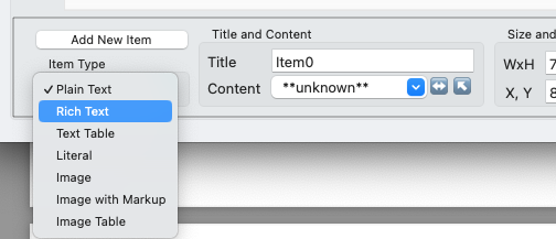
Each card item has one of several possible types:- Plain Text
- Rich Text
- Text Table
- Literal
- Image
- Image with Markup
- Image Table

The Item Type popup.
This page explains how to use each of these types.
Plain Text
When previewed or printed, the text in a Plain Text item will be obtained from a column in its template's content. The column name is specified in the Content combo box of the Item Info area. The text obtained from the content will not be interpreted in any way, and will be displayed with the item's font characteristics.Literal
When previewed or printed, the text in this item will be exactly the text in the Content combo box of the Item Info area. The content source will not be consulted. The text will not be interpreted in any way, and will be displayed with the item's font characteristics.Rich Text
When previewed or printed, the text in this item will be obtained from a field in its template's content. The field is specified by the column name in the Content combo box of the Item Info area. The text obtained from the content will be interpreted as a markup language that allows adjusting some font characteristics, specifying explicit line breaks, and embedding images. The text will be displayed with the item's font characteristics by default, but these may be modified by the markup language.See Rich Text Markup Syntax to learn how to use the markup language.
Image
When previewed or printed, this item will display an image. The image must be found in a file on disk whose name is specified in the content in the column named by the Content combo box of the Item Info area. The filename is interpreted relative to the template's Images Folder, so a value of foo.png will look for a file of that name in the Images Folder. The image will be scaled to fit the item's width and height. By default it will be proportionally scaled, but you can select a different mode by using the Image Fit control in the Effects toolbar.We recommend using images whose natural size is at least 4x the size of their image item. For example, if you want an icon to have a size of 50x50 in your Multideck layout, the image file should be at least 200x200 points. Otherwise the image will look blurry when you print or export at higher resolutions.
You may specify a “constant” image (that is, one that is displayed on every card without consulting the content source) by entering #{image}filename directly in the Content combo box, instead of a column name.
Nearly any commonly-used image format can be used with Multideck. PNG, JPEG, TIFF, and GIF files are all acceptable.
Whenever you specify an image filename in item content, you may optionally omit the file extension. In the example above, foo will produce the same result as foo.png. (This is a minor convenience, to save repetitive typing and waste of space in your spreadsheet. You're welcome.)
If you have many images in your project, you may wish to organize them in sub-folders within your main Image Folder. To refer to an image in such a sub-folder, use the relative path. So if your image file is named wood.png and it's in a subfolder resources within your Image Folder, you can refer to it as resources/wood.
Image With Markup
This item type behaves exactly the same as the regular Image type, except that its content may contain style markup and/or embedded references to other fields. Markup, if present, will be interpreted to construct an image filename, instead of using its content as the literal image filename.Example: For an Image with Markup card item, the content {*Hearts.icon} will obtain the string value of the content attribute titled "icon" in the Style named "Hearts", and use that string as the filename.
If you want to use this feature, we strongly recommend reading the entire Help section on Advanced Topics: Styles, Series, and Rotors But here are links to the most relevant pages, in case you just need a refresher on this subject:
Learn about Styles.
Learn about Content Attributes.
Learn about Style Markup.
The section on Embedded References in Rich Text Markup Syntax will also be helpful.
Text and Image Tables
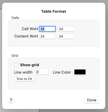
A Table item displays a rectangular array of cells, each of which can display either an image (for the Image Table item type) or a rich text string (for the Text Table item type).To set and change the characteristics of a Table item, select it and click the Table Format button in the Item Info area to open the Table Format window. Use the Cell WxH fields to specify how many points wide and high each cell in the table will be. Each row of the table will have the maximum number of cells that will fit within the width of the Table item, and similarly each column the maximum number of cells that will fit within the table's height. To fit more (or fewer) cells, you may change either the table dimensions or the cell dimensions, or both.
For Image Tables, by default each image is sized to fit its cell exactly, and since there is no spacing between cells, each image will be directly adjacent to its neighbor images in the table with no spacing between images. For Text Tables, by default each string is bounded by its cell, again with no spacing between cells.
You can make images smaller than the cell size (to get some spacing between the images) and/or have a different aspect ratio than the cells by setting different values in the Content WxH fields than in the Cell WxH fields. For text, you can use a smaller content size to inset the text within the cells.
Gridlines
By default, no gridlines are drawn around or between the cells of a table. But you can use the controls in the Item Info area to specify gridlines of any width and color. Click the Table Format button to open the Table Format window:

The Table Format window.
Important: Each cell's gridlines are drawn inside the bounds of the cell. This would make the internal gridlines (where two cells are adjacent) double-width, so to avoid that Multideck will automatically overlap adjoining cells by the width of one gridline. This means that a Table item with gridlines is smaller than if it had no gridlines, because the cells overlap.
Trim to Fit: We recommend that when you are creating and sizing your Table items with gridlines, you set your cell size gridline width before setting the size of the item. Then make your item a bit bigger than it needs to be; you don't need to be precise so long as your item has the right number of rows and columns. Finally, click the Trim to Fit button in the Table Format dialog to automatically adjust the item's size to exactly what's needed. If it's more convenient, you can click the Trim button in the Item Info area instead, without opening Table Format.
When the item is drawn, the gridlines are drawn first, then (in an Image Table) the images are drawn on top of the gridlines. If the images are larger than the open space inside the gridlines, the images will overlap the gridlines. This is okay if that's what you want, but usually you'll want to set an image size that's smaller than the cell size, and small enough that the images fit inside the gridlines.

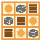
An example of an Image Table with gridlines,
made with the controls set to Show Grid, Line width 5, color orange.
See Using Text and Image Tables for more information on how to use the Image Table item type.